Candle labels and packaging work when they cover required information, stay readable on the real container, and use materials and structures that hold up through handling, display, and shipping.
Compliant candle labels clearly show identity, net quantity, maker contact, and safety warnings, and your packaging should keep that information legible while protecting the candle from heat, oil, abrasion, and shipping damage.
A great scent and clean burn don’t matter if the label curls, smears, or hides required information. Label stock, adhesive, and print method decide whether your design stays sharp on warm glass and oily fingertips. Packaging choices determine breakage rates, presentation quality, and how much time you spend reboxing returns. With a few measurements and a simple checklist, you can build labels and packs that look consistent, scan cleanly, and hold up from pour room to doorstep.
Required Candle Label Information (What matters & where it goes)
In the wider candle making process, U.S. candle labels usually cover product identity, net quantity, and responsible business details, while EU/GB products that fall under CLP need hazard communication where applicable.
Start by running a review-the-label checklist before you open your design file, because tiny jars leave no room for “we’ll squeeze it in later.” Most makers treat the front as the quick “what it is” panel and the back or bottom as the “proof and safety” panel so nothing important gets hidden by a curve or seam.
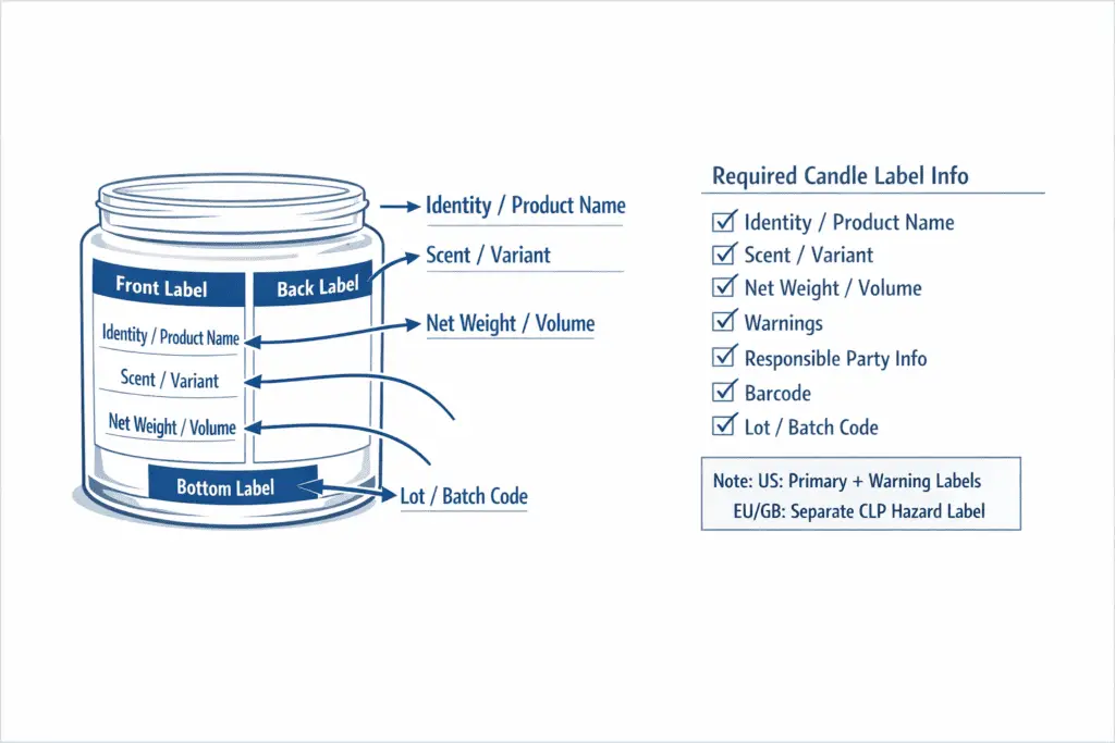
Here’s the core field set most retailers and safety guidance expect you to cover, then format it to your market and sales channel rules:
Which rules apply in the U.S. vs EU/GB?
For a typical U.S. retail candle, focus first on the primary-label basics such as identity, net quantity, and responsible business details, then add the warning panel your market or sales channel expects. For EU/GB products that require CLP, the hazard label is a separate compliance layer tied to the formula, classification, and market. For the deeper field-by-field breakdown, use candle label requirements and the wider candle safety & compliance guidance.
Primary label vs warning label vs CLP label: what is the difference?
The primary label tells the buyer what the product is and who is responsible for it. The warning label tells the buyer how to use the candle safely. A CLP label is a hazard label used when EU/GB classification rules apply, so it is not the same thing as the general front label or the ordinary burn-warning panel.
- Identity (what it is): “Scented Candle,” “Soy Wax Candle,” “Beeswax Pillar,” etc. Keep it plain and unambiguous.
- Net quantity: the amount of wax sold, often displayed in both U.S. customary and metric where relevant, placed where it’s easy to spot without turning the jar into a puzzle.
- Responsible party: business name plus a reliable way to contact you. Many sellers use an address format that supports returns and compliance questions; don’t rely on a disappearing social profile.
- Safety warnings: concise burn and fire statements, kept legible and not buried in decorative scripts.
If you sell through stores, reserve a clean barcode zone early and assign UPC/GTIN correctly so the symbol stays on the flattest surface with clear margins around it. If you’ve ever had a label look perfect on day one but start lifting after a warm cure, the same prep and placement habits that fix label peel on warm jars also help keep your required text readable through handling.
Where each element usually goes (without crowding)
A practical layout approach for small containers is “front = identity + scent/variant + net quantity,” while “back/bottom = warnings + responsible party + batch info + barcode.” Two quick contrasts help you self-audit:
- Compliant look: identity and net quantity are easy to find in one glance; warnings are grouped and readable; contact info isn’t hidden under the jar rim.
- Non-compliant look: net quantity is missing or tiny; warnings are split across panels; contact info is replaced by a social handle; barcode is wrapped over a curve so it won’t scan.
What to prioritize when space is tight
When you can’t fit everything prettily, prioritize what a shopper and a safety reviewer need first:
- Identity + variant
- Net quantity
- Warnings
- Responsible party contact
- Barcode + lot/batch code, especially for retail or wholesale
If you can’t make warnings legible on the vessel, place the warnings on the outer packaging and treat that packaging as the primary “read before use” surface. That works only when the packaging stays with the candle through sale and the buyer can read it before use.
Example layouts you can copy (then adapt to your jar)
2–3 oz tin (tightest space)
- Lid “button label”: scent/variant + brand
- Side label: identity + net quantity
- Bottom label, or small back panel: warnings + responsible party + lot code
- Barcode on outer packaging if needed
8–10 oz straight-wall jar (common retail size)
- Front: identity + scent/variant + net quantity
- Back: warnings + responsible party + barcode + lot code
Large jar / wrap label
- Front panel region: identity + scent/variant + net quantity
- Back panel region: warnings + responsible party + barcode + lot code
- Seam/overlap: keep free of small text and the barcode quiet zone
Common maker questions (and what tends to pass inspections)
“Do I need a physical address?”
Many marketplaces and retailers expect a stable, accountable contact line for consumer products; check what your sales channel requires and what your jurisdiction recognizes as “responsible party” contact.
“Are batch/lot codes mandatory?”
Not always, but they’re extremely useful for recalls, scent changes, and customer complaints, especially once you sell more than a few SKUs.
“Can icons replace warning text?”
Icons can help scanning, but don’t assume they replace the underlying safety statements your market expects; treat icons as support, not a substitute.
Preflight checklist before you print
- Confirm every label has identity, net quantity, responsible party contact, and warnings.
- Check legibility on the actual container: curvature, frosting, and dark wax can reduce contrast.
- Verify nothing critical falls into a seam, lid lip, or base curve.
- Lock a version system (date or revision code) so seasonal redesigns don’t accidentally drop required lines.
How to Choose Candle Label Materials (paper, film, foil)
The best candle label material is the one whose facestock and finish match heat, oil/wax contact, moisture, and handling, so your label stays stuck, readable, and attractive from curing shelf to customer use.
If you’re choosing stock by looks alone, you’ll eventually reprint; choose materials by durability first, then pick the finish that fits your brand. These are performance choices, not legal label-content rules. Paper can look premium and natural, films handle oil and condensation better, and foil often shines for shelf appeal, but each has predictable failure modes you can plan around.
Paper vs film vs foil: what each is good at (and where it fails)
Think in four stressors: warm glass, oily fingers, light abrasion, and storage humidity.
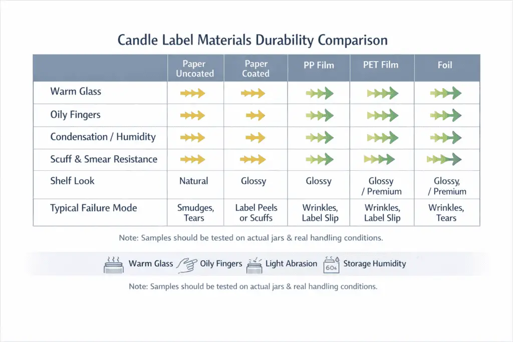
- Paper (uncoated, kraft, textured): great tactile look and easy writability, but it’s the most likely to smear, scuff, or darken from oil migration unless protected.
- Polypropylene (PP) film: a common workhorse option, usually more resistant to oil and moisture than paper at a reasonable cost, with clean print when paired with the right topcoat.
- Polyester (PET) film: typically stiffer and more heat-stable than PP, which can help on hotter surfaces or when you want a more rigid, premium-label feel.
- Foil (metallic): eye-catching and strong for branding, but it often needs lamination or a protective coat to prevent scratching and fingerprinting from turning luxury into worn.
Before you commit to a big run, test samples on your actual jar and with your real handling habits: warm cure shelf, packing tape rub, a little fragrance oil residue, and the way customers pick up the candle. If the label starts lifting at the edges on curved glass or after heat cycles, use the material choice and finish decision together with adhesive troubleshooting, rather than blaming bad labels in general.
A simple home benchmark you can repeat when suppliers change
Use 3 sample labels per material on a clean, dry container. Apply with consistent pressure, let them sit 24 hours, then test:
- Warm-shelf check: place the jar near typical cure warmth, not direct heat, and look for curling, bubbling, or adhesive creep.
- Oil-touch check: lightly touch with a clean fingertip that has a trace of carrier oil or lotion and see whether the print smears or dulls.
- Abrasion check: rub the label 10 times with a paper towel to simulate packing and handling.
- Condensation check: chill the jar briefly, then let it sweat and watch for edge lift or ink haze.
Record outcomes in a quick matrix so you’re comparing like with like:
| Material | Oil/grease fingerprints | Condensation/humidity | Scuff & smear resistance | Shelf look (matte/gloss/metallic) | Typical “fails when…” |
|---|---|---|---|---|---|
| Paper (uncoated) | Low unless protected | Low–Medium | Low | Natural/handmade | exposed to oil or heavy rubbing |
| Paper (coated) | Medium | Medium | Medium | Smooth matte/gloss | coating cracks on tight curves |
| PP film | Medium–High | High | Medium–High | Clean matte/gloss | stretched over strong curves or poor topcoat |
| PET film | High | High | High | Crisp, premium | stiffness fights very tight radii |
| Foil | Medium–High | High | Medium–High | Metallic premium | scratches/fingerprints without protection |
Reading vendor spec sheets without getting tricked by marketing words
When a listing says “water-resistant” or “weatherproof,” translate it into specifics: facestock type (paper vs PP vs PET vs foil), topcoat or laminate presence, and intended service conditions. A beautiful matte that scuffs easily is fine for gifts handed over in person, but risky for e-commerce where cartons, tape, and repeated handling do the damage.
Heat, Oil, and Wax: Selecting Label Adhesives for Candles
The right candle label adhesive stays bonded through warm glass, light oil exposure, and handling without corner lift, sliding, or cloudy silvering under clear films.
If you fix adhesive problems systematically, you can usually stop peeling and sliding without changing your whole label design. PSA (pressure-sensitive adhesive) is the sticky layer that bonds when you press the label down, and it fails most often when oil, heat, or low-energy finishes block that bond. Start by doing one thing first: run durability tests that stress oil contact on your exact container, because even a small residue can change tack and long-term hold. Then learn how to eliminate bubbles and silvering after application so clear films stay crisp instead of looking hazy.
For the full hands-on workflow, use how to apply candle labels ; this section stays at material and bond choice level.
The table below shows the most common candle-label failures and the fastest way to narrow down the real cause before you reorder materials.
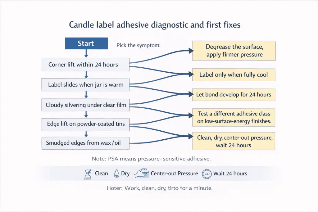
| What you see | Most likely cause | What to do first (fastest fix) |
|---|---|---|
| Corner lift within 24 hours | Oil/hand lotion on glass, or low pressure on a curve | Degrease the surface, reapply with firm pressure, and avoid labeling warm containers |
| Label slides when jar is warm | Adhesive not rated for heat, or bond not developed yet | Label only when fully cool, then let bond develop before heat exposure |
| Cloudy silvering under clear film | Micro air pockets from low pressure or textured glass | Reapply with more pressure, use a smoother application method, and avoid dusty surfaces |
| Edge lift on powder-coated tins | Low surface energy finish | Test a different adhesive class and increase pressure/dwell on application |
| Smudged edges from wax/oil | Oil migration along the edge | Improve cleaning, avoid touching adhesive edges, and consider a more oil-tolerant material/finish |
Acrylic PSA is a common adhesive chemistry that often handles aging and heat better, while rubber PSA often grabs quickly but can struggle more with heat or plasticizer-like oils depending on the formulation. For most candle jars, a permanent adhesive is the safer default; a removable adhesive is best reserved for reuse-focused concepts where you accept a higher risk of lift on warm handling.
Method note: the time-and-pressure suggestions below are practical working ranges compiled from supplier technical data sheets and aggregated maker experience, not legal requirements. Conditions like humidity, glass texture, and fragrance oil residue can shift results, so confirm with a small test batch.
A fast diagnostic that saves wasted reprints
- Let the container cool to room temperature and wipe it clean before labeling.
- Apply one label with firm, even pressure for about 10 to 20 seconds, especially at the edges.
- Wait at least 24 hours before stressing the label with heat, condensation, or packing friction, since many PSAs build bond over time.
- Warm the jar slightly, normal handled warmth, not direct heat, and watch for slide vs lift vs haze.
SDS (Safety Data Sheet) is the document that lists chemical handling and safety details for cleaners and materials, and it’s the safest way to confirm compatibility with your container finish.
Prep steps that matter more than stronger glue
A label bond succeeds when the surface is clean and the adhesive has time to wet out into microscopic surface texture:
- Clean glass with a residue-free degreaser, then do a final wipe that leaves no lint.
- Choose a cleaner that won’t leave a film on the container finish; if you’re unsure, check the cleaner’s SDS and do a small spot test.
- Let the surface fully dry before labeling.
- Avoid touching the label zone right before application, skin oils undo careful prep fast.
- Press from the center outward and finish by pressing the edges again, especially on curves.
- Give the label time to build bond before heat cycles or tight packing. Twenty-four hours is a practical minimum for many setups.
Once your adhesive holds reliably, you can size the label so the artwork and required text stay out of seams, curves, and edge-stress zones.
Candle Label Sizes and Safe Areas (jars, tins, wrap labels)
Accurate label sizing starts with measuring the container and then setting trim, bleed, and safe area so the label applies flat and text stays readable on curves and seams.
If you generate vessel-correct dielines, you reduce crooked wraps, clipped text, and wasted print runs. A dieline is a print template that shows trim, bleed, and safe area so the printer and cutter match your intent. You should adapt layout per container type because a straight-wall jar, a tapered tin, and a wrap label behave differently once you add overlap and seams. You’ll also apply labels faster and straighter if you set up a straight-label jig, even if it’s a simple guide that keeps your container and label aligned.
Trim line is where the label will be cut, bleed is extra artwork that extends beyond the trim to prevent white edges, and safe area is the inner zone where text stays clear of trimming and curvature.
Quick wrap-length calculator you can do with a ruler
These steps show the same math a calculator uses, and they keep your first proof close to reality.
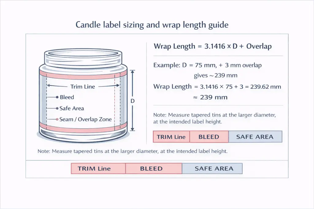
- Measure the container diameter (D) in millimeters at the label’s placement height.
- Pick an overlap, often 2 to 3 mm, so the wrap closes without a gap.
- Calculate wrap length: wrap length (mm) = 3.1416 × D + overlap.
- For tapered tins, measure both top and bottom at the label height you plan to use, then base your wrap on the larger diameter so you don’t end up short.
Example: if D = 75 mm and overlap = 3 mm, wrap length ≈ 3.1416 × 75 + 3 = 235.62 + 3 = 238.62 mm, so you’d start testing around 239 mm.
Safe areas on small labels: the curve penalty
Curvature and seams make effective safe area smaller than what looks fine on a flat screen. A label that wraps into a seam or crosses a high-stress curve will show problems first at the edges, which is why wrap labels often benefit from slightly larger safe areas near the seam side.
Tall wrap vs short wrap: visibility and seam trade-offs
A taller wrap gives more space for branding and required text, but it magnifies crooked application and can wrinkle on taper. A shorter wrap is easier to place straight and less likely to fight a curve, but it forces tighter type and may crowd warnings. If you struggle with alignment, start shorter, prove the fit, then expand the height once your placement is repeatable.
Mini-SOP: measure, template, proof, then standardize
This process turns one successful label into a reusable system across SKUs:
- Decide the label zone on the container, avoid heavy curvature and bottom-radius transitions.
- Measure height and circumference where the label will sit, then build the dieline.
- Print a low-cost proof on the same material thickness if possible, then test wrap and seam placement.
- Adjust safe area and seam position until text stays clean and the label closes without stretching.
- Save the final dieline as a versioned template so seasonal redesigns don’t break your fit.
With your sizing locked in, it becomes much easier to reserve a clean warning panel and choose icons and text that stay readable at a glance.
Candle Warning Labels & Safety Icons (what to include)
Candle warning labels work best when they pair a short set of fire-safety statements with clear pictograms, printed at a size and contrast that stays readable on a curved jar at arm’s length.
To confirm warning coverage, start from a consistent warning block you can reuse across scents and seasonal designs, then adjust only what truly changes, like container type or burn-time claims. In the U.S., consumer-safety guidance and industry standards commonly referenced by the CPSC, National Candle Association, and ASTM F2417 emphasize clear, legible warnings that customers can read before use. If your layout is tight, build a readable template first so the warning panel has reserved space and doesn’t get squeezed smaller with every redesign. After printing, maintain label legibility in storage by preventing scuffs, curl, and fading that can turn compliant text into something hard to read.
Those burn-safety statements are not the same thing as a CLP hazard label. If your candle is sold in a market where CLP applies, use the fire-safety panel and the CLP panel for their separate jobs, and use candle safety & compliance when you need the wider rule set.
The standard warning set most shoppers recognize (and why it’s used)
Because exact requirements vary by market and retailer, treat these as widely used, plain-language safety statements that fit common candle hazards:
- Burn within sight. Reduces unattended fire risk.
- Keep away from things that catch fire. Reinforces clearance from curtains, papers, décor.
- Keep away from children and pets. Prevents knocks, spills, and burns.
- Trim wick (often to about 1/4 inch / 6 mm). Helps control flame height and soot.
- Do not burn on or near anything flammable / on unstable surfaces. Reinforces placement safety.
- Stop use when wax is low. Helps avoid overheated containers and cracking in some vessels.
If you’re short on space, bullets usually scan faster than a dense paragraph, especially on 6 to 8 cm jars where curvature already makes small text feel smaller.
A practical icon + text layout that stays readable on tiny jars
Use icons as quick visual cues, but keep short text beside or under them so the meaning can’t be misread:
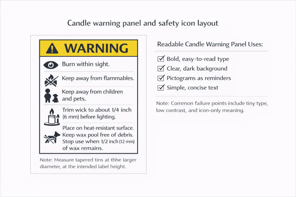
| Message block | Icon cue (what it should show) | Best placement | Common failure to avoid |
|---|---|---|---|
| Burn within sight | Eye/flame | Back or bottom panel | Burying it in decorative script |
| Keep away from flammables | Flame + crossed item | Back panel | Low contrast on kraft or dark labels |
| Keep away from children & pets | Child/pet silhouette | Back or bottom | Icon-only with no clarifying text |
| Wick trimming / safe burn | Wick/scissors | Care card or label if space allows | Tiny icon that turns into a blob in print |
Quick sizing approach, without guessing one magic number: print your warning block three ways, small, medium, and large, and choose the smallest version that stays clear at the distance someone holds a candle while shopping. If you want a fast reality check, take two phone photos of the label: one close-up and one from arm’s length, then compare readability without zooming.
Why retailers reject warning panels (and how to fix it fast)
- Too small: increase the warning block size or move marketing copy off the back panel.
- Too low-contrast: swap mid-tone inks for a high-contrast pair, or add a light backing shape behind the warning block.
- Icons export poorly: use vector icons when possible and avoid ultra-thin strokes that disappear on textured stocks.
- Crowded layout: stack the block into a single, consistent column and keep it away from seams and sharp curves.
If you want feedback before a full print run, share a cropped warning-panel proof photo in a candlemaking community critique thread and ask one simple question: “Can you read this at arm’s length?”
Font Size, Hierarchy, and Contrast for Candle Label Readability
A readable candle label uses a simple type hierarchy, generous spacing, and strong contrast so key details and warnings remain clear at the distance people shop from.
To build readable micro-format templates, start by deciding what must be read in one glance (identity, scent/variant, net quantity), what must be read before use (warnings), and what can be secondary (story copy). Next, size and place safe areas precisely so text never rides the trim edge, the seam, or the jar’s tightest curve. Finally, keep color drift within tolerance across reprints by approving a reference print and checking future runs against it, so your brand colors don’t drift into low-contrast territory over time. Treat the size and contrast guidance in this section as readability best practice, not a universal legal minimum.
A simple hierarchy that works on most jars and tins
Aim for three levels of type, each with a clear job:
- Primary (front): product identity + scent/variant
- Secondary (front/back): net quantity + key claims you can support
- Utility (back/bottom): warnings, contact details, batch code, barcode
If your label feels busy, it’s usually not the font, it’s the lack of spacing. Increase line spacing slightly, reduce the number of type styles, and keep headings and body text distinct.
Small-type legibility without guessing: use a printed type ladder
Instead of picking sizes on-screen, print a ladder on the actual label material:
- Set your warning paragraph at three sizes, for example 6 pt / 7 pt / 8 pt, with the same line spacing.
- Print at 100% scale and test readability at arm’s length under normal indoor lighting.
- Choose the smallest size that reads comfortably, not the smallest size you can barely decipher.
A quick way to avoid muddy small text: prefer clean, open letterforms and avoid ultra-thin strokes or high-contrast display serifs for utility copy. Script fonts can be beautiful for brand marks, but they’re the first to fail at tiny sizes.
Contrast on kraft, dark labels, and clear films
Contrast isn’t just light vs dark, it’s how distinct letter shapes remain once ink spreads slightly and the container curves the view:
- On kraft or textured paper, very light inks can lose edge definition; consider darker ink, a light backing shape, or a dedicated warning panel box.
- On clear labels, glass and wax color become your background; test on filled candles, not empty jars.
- Keep utility text away from busy patterns; a clean rectangle behind warnings often improves readability more than changing fonts.
Mid-process proof habit: take a phone photo of your printed proof at the same distance a shopper holds the candle. If the camera struggles to resolve the warning text, people will too.
Color drift control (so readability doesn’t degrade over seasons)
A practical workflow is simple: approve one golden sample, store it in a dark, dry place, and compare future prints to it before you commit to a full run. If the new print looks duller, darker, or closer to the background color, adjust before the warning block becomes hard to read.
Inkjet vs Laser vs Professional Printing for Candle Labels
Inkjet, laser, and professional press printing can all work for candle labels if the result stays readable on your chosen stock, container, and handling conditions.
At seed level, the decision is simple: match the print route to your stock, durability target, and run size. Use how to apply candle labels when handling tests matter more than print theory, and use candle packaging cost when the main question is per-unit math.
How to Apply Candle Labels Without Bubbles or Crooked Edges
Straight, bubble-free label application comes from clean containers, consistent alignment landmarks, firm even pressure, and a repeatable workflow that doesn’t change from jar to jar.
Clean prep, consistent landmarks, and even pressure matter more than speed. For the full workflow, defect fixes, and tool choices, use how to apply candle labels.
Labeling Different Containers: Jars vs Tins vs Pillars
Jars, tins, and pillars need different label placement and materials because their surfaces, curves, and heat exposure change how well labels stick and how readable they stay.
At seed level, the rule is simple: straight-wall jars are easiest for front/back panels, tins need careful lid and side placement, and pillars often rely on bands or outer packaging instead of adhesive on wax. For vessel-specific fit and measurement details, use candle containers & jars.
Water-Resistant, Oil-Resistant, and Waterproof Labels (what you really need)
Water-resistant handles condensation and splashes, waterproof survives full immersion without delaminating, and oil-resistant prevents smears, stains, and ink transfer from oily hands or fragrance residue.
Start by choosing the durability target based on where the candle will live. Bathrooms and shipping condensation push you toward water resistance, kitchens and frequent handling push you toward oil resistance, and outdoor markets or wet weather are where true waterproofing matters. If you’re choosing stock, compare PP vs PET vs foil by what they resist and by how they behave on curves and seams. If the label looks fine but the print smears or dulls during handling, improve smear resistance on desktop prints with the right ink/toner expectations and a protective top layer.
What those durability words actually mean in practice
- Water-resistant: survives condensation rings, light splashes, and humid storage with minimal wrinkling or edge lift.
- Waterproof: stays intact through a short dunk, with no edge lift, clouding, or ink bleed once dried.
- Oil-resistant: resists fingerprint darkening, oil staining, and rub-off when touched after someone has lotion, cooking oils, or fragrance residue on their hands.
For most candle brands, oil resistance is the bigger day-to-day problem, while water resistance is the common shipping and bathroom problem.
A capability matrix you can use to pick the cheapest option that works
| Label build | Condensation (water-resistant) | Short dunk (waterproof) | Oily touch + rub | Best use-case |
|---|---|---|---|---|
| Uncoated paper | Low | Very low | Low | Low-handling gift labels, dry indoor use |
| Coated paper (no laminate) | Medium | Low | Medium | Retail indoors with careful handling |
| Paper + clear laminate | High | Medium–High | High | Most premium paper-look lines |
| PP film | High | Medium–High | High | Kitchens, bathrooms, frequent handling |
| PET film | High | High | High | Higher heat exposure, very frequent handling |
| Foil + protective top layer | High | Medium–High | Medium–High | Shelf impact when scuffing is controlled |
When you truly need waterproof
Choose waterproof builds when candles are likely to be exposed to rain, wet outdoor events, or repeated splashing where a soaked label would become unreadable. If your candles live indoors and the worst case is humidity or a sweaty cold jar, water-resistant + oil-resistant performance is usually the smarter target.
UPC Barcodes and Batch Codes on Candle Labels (GS1 basics)
A barcode that scans reliably needs the right symbol type, enough clear space around the bars, and placement on the flattest available surface so retail scanners can read it quickly.
To implement retail-ready codes, treat barcode sizing and placement as a design constraint you decide before you finalize typography and artwork. GS1 is the global standards body that manages GTIN (Global Trade Item Number) identifiers and publishes barcode specifications many retailers follow. If you’re still tightening compliance details, align with the core legal label elements first by using candle label requirements so barcode and warnings don’t compete for the same tiny real estate. Barcode placement is an operational retail requirement, not a substitute for the identity, net quantity, responsible-party, and safety text. Then choose a durable print method so the bars don’t smear, glare, or scuff into a no-read during handling.
UPC (Universal Product Code) is the common 12-digit retail barcode in North America, while EAN (European Article Number) is a common global retail format used outside the U.S. Quiet zone is the blank margin on both sides of the bars that scanners need to see where the symbol starts and ends. In practice, most scan failures on candles come from one of three issues: the barcode is printed too small for the resolution, it wraps over a curve, or the quiet zone gets invaded by borders, patterns, or nearby text.
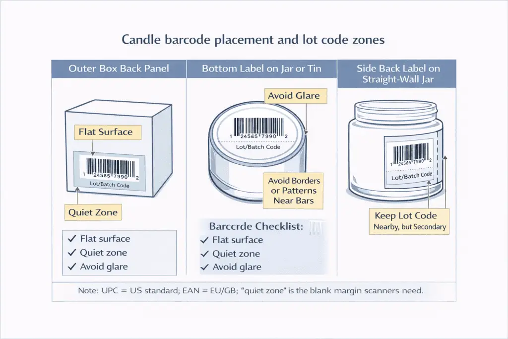
Core barcode checklist
- Use a standard retail 1D code format appropriate for your market and retailer requirements.
- Keep the code on the flattest panel you have.
- Preserve the quiet zone by keeping nearby graphics and borders away from the symbol.
- Avoid high-glare finishes over the bars unless you’ve tested scanning under bright retail lights.
- Print at a resolution that keeps the narrow bars crisp.
Methods note: the resolution and placement guidance above reflects common barcode practices and typical retail scanner behavior, but your exact pass/fail depends on printer calibration, label finish, curvature, and glare. Validate with a small print run and a real scan test.
Where to place the barcode on a candle
A barcode reads best when it’s flat and not distorted. If your container is very curved or your label space is tight, putting the barcode on the outer packaging can solve both scan reliability and visual clutter.
| Placement option | Best for | Most common pitfall | Simple fix |
|---|---|---|---|
| Outer box back panel | Retail + shipping | Window glare or crowded panel | Reserve a clean code zone and keep borders away |
| Bottom label on jar/tin | Small containers | Scuffs from surfaces | Use a more scuff-resistant finish and keep it centered |
| Side back label (flat area) | Straight-wall jars | Wrapping over curvature | Keep the symbol fully within the flattest section |
Batch/lot codes: how to add traceability without clutter
A lot code is your internal identifier that ties a unit back to a pour date, wax batch, fragrance batch, or production run. Keep it short, consistent, and easy to read in a support email.
A simple, scalable format looks like: YYMMDD–Run–Variant (example: 250115–B03–AMBR). Place the lot code where it’s visible but not visually dominant, often near the barcode on the back or bottom panel, or on the outer packaging if you use boxes.
Once your codes scan cleanly, the next decision is packaging, because the best barcode in the world won’t help if the candle arrives cracked or the label is abraded beyond readability.
Packaging Options: Boxes, Tubes, Bags, and Wraps
The best candle packaging balances protection and presentation by matching the package structure to the container’s fragility, your sales channel, and how far the product will travel.
At seed level, separate retail presentation from shipping protection: boxes, tubes, bags, and wraps solve different presentation and protection problems, and the right choice depends on container type, sales channel, and travel distance.
Use choose candle packaging for the full structure comparison, and use package candles for shipping when the main question is transit protection rather than shelf presentation.
Inserts, Care Cards, and Thank-You Notes (what to include)
A simple insert reduces returns and support emails by telling customers how to burn safely, how to prevent tunneling and soot, and what to do if they see an issue.
If you sell in person, inserts can be minimal; if you ship, inserts do double duty as education and damage control. The key is to keep the card short, legible, and consistent across SKUs, then add a small variant line only when something truly changes.
What to include on a burn-care card
- First burn guidance
- Wick trimming: when and how
- Burn time limits
- Safe placement
- Stop points: when to stop burning
- Troubleshooting: quick fixes for tunneling, mushrooming, soot, or weak hot throw
Thank-you notes that don’t create compliance problems
A thank-you note is fine, but keep it separate from required warnings so you don’t accidentally replace critical safety text with marketing copy. If you include review requests or social handles, place them on the thank-you card, not on the warning panel.
Inserts that improve packaging performance
If labels scuff during shipping, a thin tissue wrap or a snug insert that prevents rubbing can preserve the finish. For glass jars, top-and-bottom restraint is often the biggest breakage reducer because it stops the jar from building momentum inside the carton. For the full transit-protection workflow, use package candles for shipping.
Sustainable Candle Packaging (materials, claims, end-of-life)
The most realistic eco choice is the one your customers can actually dispose of correctly where they live.
To evaluate options without vague marketing language, keep a simple proof trail for every claim and design your structure so end-of-life sorting is plausible. If you sell refills or encourage jar reuse, design labels to remove cleanly first, then choose materials that won’t fail around oils, heat, and handling.
Here is a quick claim-to-proof tracker that shows what to document per SKU:
| Claim you print | What it usually means | Proof to keep on file |
|---|---|---|
| FSC paper | Paper fiber comes from certified or controlled sources | FSC chain-of-custody detail from the supplier |
| Recyclable | The package can be recycled in some systems | A note on the target material stream + your structure |
| Compostable | The material may meet a compostability standard in specific facilities | The exact standard the supplier claims + their test/cert documentation |
| PCR content | Some portion is post-consumer recycled | PCR percentage statement from the supplier + spec sheet |
| Plastic-free | No plastic components in the packaging system | Component list and supplier declarations |
Keep sustainability claims tied to proof, and keep material choices realistic for oil, heat, and handling. Use choose candle packaging if you need the deeper structure trade-offs.
Gift Sets and Seasonal Packaging (bundles, windows, and shrink)
Gift sets sell on presentation, but they fail on shipping and shelf wear when the structure is too weak or the contents can rattle.
Start by deciding what the set must do: look premium in photos, survive handling, and keep items aligned so labels don’t scrape each other. Windowed cartons increase visibility but can reduce stiffness; compensate with stronger board, tighter inserts, or a sleeve that adds structure. For deeper structure selection, use choose candle packaging.
Shipping Protection for Candles (drop tests, void fill, fragile marks)
Shipping success is mostly about stopping movement and absorbing impact, not about adding more padding randomly.
A simple pass standard is: the candle should not rattle in the shipper, and it should survive typical corner and edge drops without jar-to-wall contact. Use inserts to hold the candle off the outer walls, and use void fill only after restraint is correct. For the full packing sequence, tests, and void-fill workflow, use package candles for shipping.
Retail Readiness: Case Packs, SKU labels, and shelf presentation
Retail readiness means clean identity, reliable scanning, and packaging that still looks presentable after handling. For case-pack strategy, SKU operations, and sales-side retail prep, use candle business & sales.
Cost Calculator (Labels & Packaging per Unit)
A usable per-unit cost includes materials, waste, and labor time, not just what you pay for labels and boxes.
At seed level, cost is mainly a reminder to count materials, waste, and labor together instead of pricing labels and boxes in isolation. For the full per-unit math, use candle packaging cost.