Candle care cards and customer-facing box inserts are small printed or scannable messages placed inside candle packaging. They work when they give the customer one useful post-purchase action they can read, keep, scan, or follow.
Candle care cards and box inserts are small printed or scannable messages placed inside candle orders, gift boxes, or product packaging. They help buyers use the candle correctly, find help, understand gift details, or take a simple next step after purchase. “Actually use” means the customer reads, keeps, scans, follows, reviews, reorders, or contacts you because the insert solves a real need. These cards can improve candle use and customer experience, but they do not replace required warning labels, safety labels, packaging-cost planning, label-material choices, or shipping-protection design.
- Decide What Job the Insert Must Do
- Choose the Right Insert Format Before You Design It
- Write the Candle Care Instructions Customers Need First
- Prioritize the Message So the Card Does Not Get Ignored
- Design the Card So It Can Be Read, Skimmed, and Scanned
- Place the Insert Where Customers Will Actually See It
- Use QR Codes Only When They Continue a Useful Job
- Build a Reusable Care Card Template for Multiple Candles
- Test Whether Customers Read, Keep, Scan, or Follow the Insert
Decide What Job the Insert Must Do
A useful candle care card or box insert gives candle buyers practical post-purchase guidance they can read, keep, scan, or act on.
A candle care card or box insert is a small printed or scannable message placed inside candle packaging. Its primary job should be clear before you write copy, choose paper, add a QR code, or decide where it sits in the box.
“Actually use” means the customer does something observable: reads the insert, keeps it, scans it, follows the care advice, leaves a review, reorders, contacts support, or asks fewer repeated care questions. A decorative card may look polished, but it fails if it does not help the buyer use the candle after it arrives.
Use one primary job first:
| Insert Element | Customer Action | Proof Signal |
|---|---|---|
| Burn-care instruction | Follows first-burn or wick-trim advice | Fewer repeated care questions; review mentions care guidance |
| QR code to care guide | Scans for deeper help | QR scan; support-page visit |
| Gift-recipient note | Understands how to use the candle | Fewer recipient questions; positive gift feedback |
| Review prompt | Leaves a neutral review | Review count or review mention |
| Reorder prompt | Revisits the product page | Reorder link click or repeat purchase signal |
| Support note | Knows where to ask for help | Fewer confused messages; more direct support requests |
| Scent-use note | Understands burn timing or room-use fit | Fewer expectation complaints; clearer review language |
These are practical use signals, not proof that the insert caused the action by itself. Treat them as signs to watch when you later measure whether customers use inserts.
The lowest-risk starting job for most candle sellers is care guidance: first burn, wick trimming, burn time, and what to do before relighting. Support, gift, review, or reorder messages can work, but they should come after the customer’s main use need is handled. Care cards are not warning labels, so do not use a removable insert as the place where required cautionary information lives.
A strong insert tells the customer what to do next, while a weak one asks the customer to guess which message matters most. Once the job is clear, match that job to the right printed or scannable format.
Choose the Right Insert Format Before You Design It
The correct format depends on what the customer needs to do after opening the candle package.
A care card explains use, a box insert guides the unboxing moment, a thank-you card adds warmth, a QR card extends information, a hang tag supports quick product notice, and a warning label handles required cautionary information. A “box insert” here means a customer-facing message asset, not cushioning, dividers, molded trays, or shipping protection.
Choose the format by matching the message job to the customer moment. One card should not carry every message with equal weight because burn care, gratitude, QR support, review prompts, and warnings do not all need the same space or timing.
| Format | Best Use | Avoid When | Customer Action Supported | Bridge Note |
|---|---|---|---|---|
| Care card | Burn-care basics and support | Legal warnings are the main need | Read, keep, follow | Use a separate route for candle warning label requirements |
| Box insert | First-visible package message | It becomes cushioning or structure | Notice, read, keep | Structural packaging belongs outside this card decision |
| Thank-you card | Appreciation or gift setting | It buries care instructions | Feel acknowledged, remember brand | Keep care guidance visible |
| QR card | Deeper care, video, support, reorder | The QR replaces essential printed care | Scan, learn, review, reorder | Use QR only when it continues a useful job |
| Hang tag | Retail shelf or product display cue | It replaces required labels | Notice, read briefly | Label placement belongs in a separate label decision |
| Warning label | Required cautionary information | Used as a removable care-only card | Follow safety warnings | Care cards are not candle warning labels |
This matrix is a practical sorting tool for candle packaging messages, not a legal label guide. Use it to choose candle packaging insert formats before design so the customer sees the right message in the right place.
A care card is usually best when the customer should keep the information near the candle. A box insert works when the message should be seen as soon as the package opens. A thank-you card works when the customer already has the basic care information elsewhere. A QR card works when the printed card would become crowded, but the most important care steps should still be readable without scanning.
If you need to compare candle care cards, labels, and warning labels, separate the purpose first: care cards explain candle use, brand or thank-you cards support the order experience, and warning labels carry cautionary information that should not depend on whether the customer keeps a loose insert. If your concern is broader than the insert itself, plan the full candle packaging experience separately so the care card does not become a brochure, label guide, cost plan, and shipping system at the same time.
After the format is chosen, write the candle care instructions before adding secondary messages.
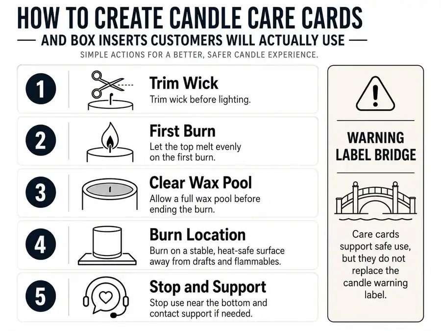
Write the Candle Care Instructions Customers Need First
The most important care-card content is the practical burn guidance the customer needs before and during candle use.
A candle care card can explain how to use the candle, but it is not a substitute for required candle warning labels, legal compliance text, CLP labeling, ASTM interpretation, or jurisdiction-specific safety language. “Care” means practical burn-use guidance: what the customer should do before lighting, during the first burn, during later burns, and when the candle should no longer be used.
A basic candle care card should include the wick-trim instruction, first-burn instruction, wax-pool cleanliness note, burn-location cue, burn-time limit cue, stop-use cue, and a support route. Keep these as short printed actions before adding thank-you copy, review prompts, or QR content.
A candle care card should say the essential candle-use actions first: trim the wick, burn long enough for an even melt pool, keep the wax pool clear, use the candle away from unsafe conditions, and stop burning when the candle should no longer be used. If the buyer needs formal safety or labeling details, route that need to candle warning label requirements or CLP and candle safety label requirements instead of turning the insert into legal label copy.
| Care Instruction | Plain-Language Card Copy | Why Customers Need It | Warning-Label Bridge Needed |
|---|---|---|---|
| Trim wick | Trim the wick before each burn. | Helps reduce soot and uneven burning. | No |
| First burn | Let the wax melt evenly across the top on the first burn. | Helps prevent tunneling. | No |
| Clear wax pool | Keep wick trimmings and debris out of the wax. | Reduces burn problems. | Possible safety bridge |
| Burn location | Burn on a stable, heat-safe surface. | Supports safer use. | Yes |
| Burn time | Do not burn longer than the maker’s stated limit. | Helps reduce overheating and poor performance. | Possible safety bridge |
| Drafts | Keep the candle away from drafts while burning. | Helps reduce flicker, soot, and uneven melting. | Possible safety bridge |
| Extinguish cleanly | Extinguish the flame fully before leaving the room. | Supports safer handling after use. | Yes |
| Stop-use cue | Stop using the candle when little wax remains. | Reduces overheating risk. | Yes |
The copy examples are customer-facing care wording, not formal label language. Use the table to separate helpful card copy from care card versus candle warning label decisions.
Organize the card by customer moment. Before lighting, tell the buyer to trim the wick and clear the wax pool. During the first burn, tell them to allow an even melt pool. During later burns, remind them to trim again, avoid drafts, and watch the candle surface. After extinguishing, tell them to let the wax cool before relighting or moving the container. When something looks wrong, tell them to stop using the candle and contact support rather than guessing.
Do not hide the essential care steps behind a QR code only. A scan can expand the instructions, but the printed insert should still carry the core burn-care actions the customer needs at the candle.
Once the care copy is clear, the next problem is order: the card must decide what stays printed, what moves behind a QR code, and what gets removed.
Prioritize the Message So the Card Does Not Get Ignored
Customers are more likely to use an insert when the card gives one clear first action instead of several equal-weight messages.
A candle care card or box insert is a limited-space communication asset. “Useful” does not mean complete; it means readable and actionable at the moment the customer opens, gifts, lights, or stores the candle.
Put the customer’s most urgent post-purchase need first, usually candle care. Then add support, a short thank-you line, a review request, a reorder prompt, or a brand note only if it does not crowd the main action.
| Message Type | Print on Card | Move to QR | Remove | Reason |
|---|---|---|---|---|
| Essential burn-care steps | Yes | Only as expanded support | No | Customer needs it immediately |
| Full care guide | Short version only | Yes | No | Too long for a small card |
| Support route | Yes, if brief | Yes, for forms or help pages | No | Helps customers act when confused |
| Thank-you note | Brief version | Optional | No | Supports the experience but should not bury care |
| Gift note | Brief version or split card | Optional | Sometimes | Useful for gift boxes when care remains visible |
| Review request | Secondary line | Optional | Sometimes | Should not outrank care |
| Reorder or social prompt | Secondary line | Optional | Sometimes | Useful only after the main care action |
| Brand story | Rarely | Yes | Often | Low immediate customer need |
| Product catalog | No | Optional | Often | Can become clutter |
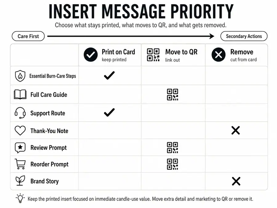
Rank each message by immediacy, customer need, readability, and space. If the information is long, changing, optional, or secondary, move extra care details behind a QR code instead of shrinking the printed care copy until it becomes hard to read.
Customers ignore inserts when the card asks them to process too many equal choices. Common failure signs include several prompts with the same visual weight, care instructions in tiny text, a QR code with no reason to scan, and a founder story placed before burn-care instructions.
Use this editing checklist before printing:
- The first visible line tells the customer what to do.
- The care instructions remain readable without scanning.
- The QR code adds help instead of replacing essentials.
- The thank-you line is short enough to support, not bury, care.
- The review or reorder prompt is secondary.
- The brand story is removed, shortened, or moved behind a scan.
- The card still makes sense to a gift recipient who did not buy the candle.
Add Thank-You and Gift Copy Without Burying Care Instructions
Thank-you copy supports the candle insert only when it stays secondary to the customer’s care need.
A short thank-you line can help first-time buyers, handmade-order customers, and gift recipients feel oriented. It hurts the insert when it becomes a long founder story, repeats another card, hides care instructions, or crowds the QR and support details.
| Message Block | Lead or Secondary | Best Use Case | Risk If Overused |
|---|---|---|---|
| Care instruction | Lead | Every care card | None if concise |
| Thank-you line | Secondary | Handmade or giftable orders | Can bury care |
| Gift note | Secondary or split card | Gift boxes | Recipient may miss care info |
| Brand signature | Secondary | Brand recall | Can become brochure copy |
| Founder story | QR or omit | Deep brand storytelling | Crowds useful guidance |
Use a pattern like: “Thank you for choosing our candle. For the best burn, trim the wick before each use.” That keeps gratitude attached to action. If the thank-you or gift message needs more room, build a reusable care card template with a fixed care block and a separate optional gift block.
Add Review or Reorder Prompts as Secondary Actions
Review and reorder prompts belong after useful care information, not before it.
A review line can work when it feels optional and neutral. A reorder prompt can work when the customer already knows how to use the candle and wants the scent again. Neither should make the insert feel like an ad before it has helped the customer.
| Prompt Type | Better Copy Pattern | Avoid | Why |
|---|---|---|---|
| Review request | If you enjoyed your candle, a review helps our small shop. | Leave us five stars. | Keeps the request neutral |
| Reorder prompt | Save the scent name for your next order. | Buy again now. | Connects to customer need |
| Social prompt | Tag us if you share your candle setup. | Post this and tag us today. | Keeps action optional |
| Support prompt | Questions about the burn? Contact us before relighting. | Message us only if there is a problem. | Helps the customer act safely |
| QR prompt | Scan for the full care guide and support details. | Scan for everything. | Gives a clear reason to scan |
Review language can be affected by sales-channel rules, so check marketplace review request rules when the candle is sold through a marketplace or platform. For the insert itself, keep the prompt short, neutral, and lower than the care steps.
After the message order is set, design should make that order obvious at a glance.
Design the Card So It Can Be Read, Skimmed, and Scanned
Design should make the candle-care message easier to read, skim, and act on before it makes the card look pretty.
A candle care card layout should serve the message, not decoration alone. Pretty means the card looks appealing; usable means the customer can quickly find the burn-care instruction, understand the next step, and scan any QR code without confusion.
Use visual order to match message priority. Put the main care action first, separate care, thank-you, support, QR, and review prompts into clear blocks, and leave enough blank space that the card does not feel like a miniature brochure.
| Check | Pass Condition | Failure Signal |
|---|---|---|
| Care action visible first | Customer sees the main instruction immediately | Brand copy appears first |
| Text readable | Care copy is legible at card size | Tiny text or crowded icons |
| QR scannable | QR has high contrast and clear space | QR blends into artwork |
| Sections clear | Care, thank-you, QR, and prompts are separated | Every message has the same weight |
| Gift setting clear | Recipient understands the card without buyer details | Message assumes the original buyer |
| Icons meaningful | Icons point to care, scan, support, or gift use | Icons decorate without helping |
| Back side useful | Second side carries slower details | Back side repeats the front |
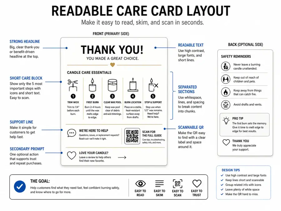
A scannable card does not need advanced design. It needs a clear headline, short lines, enough contrast, section labels, useful spacing, and a QR code that is not trapped inside artwork. If a QR code is used, label why the customer should scan it, such as “Scan for the full burn-care guide” instead of a vague “Scan me.”
Keep icons simple. A flame icon can mark burn guidance, scissors can mark wick trimming, and a phone or square code can mark digital help. Decorative icons hurt the card when they make the eye work harder to find the care instruction.
Use two sides only when the second side reduces crowding. The front can carry the first-use care steps, while the back carries support, gift, review, or QR details. If both sides feel crowded, the issue is message priority, not card size.
A repeatable layout helps later because you can build a reusable care card template with the same care block, QR block, and optional message block across multiple candle lines.
Choose a Card Size and Paper That Stay Readable
Choose the smallest card size and simplest paper that keep the care instructions readable, fit the package, and support scanning or retention.
Card size and paper should be chosen for customer use, not print luxury. The best option is the one that survives normal handling, fits the candle box without bending, and leaves enough room for care instructions and any QR code.
| Size or Material | Best Use Case | Avoid When | Customer-Use Effect |
|---|---|---|---|
| Business-card size | Very short care copy plus QR | Multiple care steps are needed | Easy to keep, easy to overcrowd |
| 3.5 × 5 card | Basic care plus thank-you line | Large QR or long copy is needed | Balanced readability |
| 4 × 6 card | Care steps, QR, and secondary prompt | Small packaging | More room, higher discard risk |
| Folded insert | Longer instructions | Customer needs a quick skim | More content, more friction |
| Matte cardstock | QR readability and small text | A glossy brand look is required | Less glare |
| Gloss finish | Brand-forward appearance | QR or small text matters most | Can create glare |
| Heavier cardstock | Gift boxes or keepsake-style cards | The card raises bend or fit issues | Feels durable, may feel bulky |
| Light cardstock | Simple ecommerce orders | The card may crease in transit | Lower bulk, lower keepsake feel |
Use choose card size and paper for readability as the main decision rule. A larger card is not automatically better if it looks like filler, and thicker paper is not better if it makes the box close poorly.
This part covers paper cards and inserts only. Adhesive label materials, waterproof label testing, and candle label durability belong outside the care-card layout decision.
Once the card is readable in the hand, its placement inside the candle package decides whether the customer notices it at all.
Place the Insert Where Customers Will Actually See It
A care card only works if the customer can see it when they open or use the candle.
Placement is visibility planning for a message insert. A box insert here means a printed or scannable message placed inside the package, not molded inserts, dividers, cushioning, warehouse packing steps, or shipping-protection systems.
Put the insert at the first natural opening moment where the customer can see the message without digging, bending the card, or mistaking it for filler. The goal is not just a prettier unboxing moment; it is a better chance that the buyer notices, reads, keeps, scans, or follows the post-purchase guidance.
| Placement | Visibility Risk | Bend / Discard Risk | Best Use Case | Avoid When |
|---|---|---|---|---|
| On top of candle | Low | Medium | First-visible care note | Card may rub, bend, or slide |
| Inside lid | Low | Low | Premium box or gift box | Lid may be discarded |
| Under tissue, above filler | Medium | Low | Gift presentation | Customer may miss it |
| Beside candle | Medium | Medium | Larger box | Card can shift during handling |
| Attached with sticker or band | Low | Medium | Controlled reveal | Sticker damages card or hides text |
| Tucked under candle | High | Medium | Rarely useful | Customer must remove product first |
| Mixed with filler | High | High | Not recommended | Card looks disposable |
For ecommerce orders, place the insert where the customer sees it before handling loose filler. For gift boxes, make the message easy for the recipient to understand without knowing the buyer’s order details. For boxed candles with lids, the inside-lid position can work well when the card remains flat and the message is still visible.
Do not solve shipping protection through the care card. If the real issue is crushed boxes, broken jars, dividers, or cushioning, choose candle packaging materials separately because those decisions protect the product rather than explain how to use it.
Do not turn placement into a full budget plan either. If the insert format creates repeat cost or wholesale margin questions, calculate candle packaging costs outside the care-card visibility decision.
After the customer can see the insert, a QR code should only be added when scanning continues a clear customer job.
Use QR Codes Only When They Continue a Useful Job
A QR code belongs on a candle care card or box insert only when it continues a useful customer job, not as decoration.
QR codes are optional on candle inserts. They should not replace the printed care steps customers need before burning the candle, such as wick trimming, first-burn guidance, and clear support instructions.
Use a QR code when the printed card is too small for deeper help or when the customer needs a digital next step. A scan counts as use only when the destination helps the customer learn, troubleshoot, review, reorder, or get help. It is a weak use signal when the code leads to a generic homepage with no clear job.
| QR Destination | Useful When | Avoid When | Customer Action Supported | Measurement Signal |
|---|---|---|---|---|
| Full care guide | Printed card is too small | Essential care is hidden | Learn more | Scan, page visit |
| Burn-care video | Visual instruction helps | Video only repeats the card | Watch, follow | Scan, watch signal |
| Troubleshooting page | Customer may see tunneling, soot, or poor burn behavior | It becomes a full support maze | Fix a use issue | Page visit, support reduction |
| Support page | Customer may need help | Support is hard to find after scanning | Contact support | Support visits |
| Reorder page | Customer wants the same scent again | The reorder prompt outranks care | Reorder | Link click |
| Neutral review page | The request is optional and allowed by the selling channel | Platform rules restrict review requests | Review | Review visit |
| Gift-recipient guide | The recipient did not buy the candle | It repeats the buyer’s order message | Understand the gift | Scan, page visit |
| Homepage | Rarely | It gives no clear customer job | Unclear | Weak signal |
Treat this table as a planning aid, not measured customer data. A QR scan can show that someone interacted with the insert, but it does not prove that the customer read, understood, or followed every care instruction.
Use a QR code to move extra care details behind a QR code when the printed card already carries the basic care actions. The QR label should tell the customer what they get after scanning, such as “Scan for the full burn-care guide,” “Scan for help with tunneling,” or “Scan to save this scent.”
Place the QR code where the customer can see it, scan it, and understand it without rotating the card several times. Keep contrast high, leave clear space around the code, avoid patterned backgrounds behind it, and do not put it so close to an edge that packaging bends or glare makes scanning hard.
You can measure QR scans as an insert-use signal, but keep the claim narrow. Scans help you see one kind of interaction; they do not replace customer messages, support patterns, review language, or reorder behavior. The stronger test is whether the QR destination solves the exact job promised on the card.
Once digital overflow is handled, a reusable template keeps the care message consistent across scents, sizes, and seasonal versions.
Build a Reusable Care Card Template for Multiple Candles
A reusable candle care card template works by separating fixed care information from variable product or campaign details.
A template is a repeatable communication structure for candle care cards and box inserts. It is not just a decorative design file, a full brand system, a product catalog, or an inventory-management setup.
The point is to keep the care message stable while letting scent names, QR destinations, gift notes, and seasonal copy change without breaking the card. This matters when a seller has multiple candle scents, jar sizes, collections, market batches, or gift-box versions. If every version is rewritten from scratch, care instructions can drift, temporary offers can crowd the main action, and old QR destinations can remain on printed cards.
| Template Block | Purpose | Fixed / Variable / Optional | Example Copy Slot | Update Risk |
|---|---|---|---|---|
| Burn-care basics | Core customer guidance | Fixed | “Trim wick before each burn.” | Low |
| Brand name | Recognition | Fixed | Brand footer | Low |
| Support route | Help | Fixed or variable | Support QR or contact line | Medium |
| Scent name | Product specificity | Variable | “Lavender + Cedar” | Medium |
| Burn-time note | Product-specific use cue | Variable | “Burn for up to ___ at a time.” | Medium |
| QR destination | Deeper help or support | Variable | Care guide, video, support page | High |
| Collection note | Product grouping | Variable | “Winter collection” | Medium |
| Gift note | Gift-recipient message | Optional | “A little light for your space.” | Low |
| Seasonal offer | Campaign message | Optional | Holiday message | High |
| Review prompt | Secondary action | Optional | Neutral review line | Medium |
Use this table as a content-control model. Fixed blocks should rarely change, variable blocks should be checked for each candle version, and optional blocks should be removed when they compete with care instructions.
Use a Simple Front-and-Back Care Card Pattern
A simple front-and-back care card pattern gives the customer the main care action first and slower support details second.
| Card Area | Copy Role | Example |
|---|---|---|
| Front headline | Main action | “Before you light your candle” |
| Front care line 1 | Wick action | “Trim the wick before each burn.” |
| Front care line 2 | First burn | “Let the wax melt evenly across the top.” |
| Front care line 3 | Clean wax pool | “Keep wick trimmings and matches out of the wax.” |
| Back support line | Help route | “Questions about the burn? Scan or contact us before relighting.” |
| Back QR label | Digital continuation | “Scan for the full care guide.” |
| Back secondary line | Optional brand action | “Save the scent name for your next order.” |
This is a message-layout pattern, not a warning-label template or legal compliance label.
Set up the template in five steps:
- Choose the main card job: care, gift help, QR continuation, support, or a secondary prompt.
- Lock the fixed care copy so every candle gives the same basic burn guidance.
- Create variable slots for scent name, size, collection, burn note, or QR destination.
- Reserve optional space for gift notes, seasonal messages, or review prompts.
- Print one sample version and check readability, fit, QR scan quality, and message order before scaling.
You can use an editable design file as long as the structure serves customer action. A good editable template has clear blocks for care, variable product details, QR, and optional copy. A weak template looks finished but forces you to shrink care instructions each time you add a scent or seasonal note.
Use build reusable candle packaging templates only for the printed message system, not for full packaging design standards. If the work turns into SKU naming, inventory rules, wholesale catalogs, or enterprise packaging documentation, that has moved beyond care cards and box inserts.
The safest pattern is to adapt care cards for multiple candle scents by changing only the variable slots. Do not hardcode temporary content, short-lived discount language, event names, or seasonal QR destinations into an evergreen care card unless you are prepared to reprint it.
The next step is to check whether customers are actually reading, keeping, scanning, or following the insert.
Test Whether Customers Read, Keep, Scan, or Follow the Insert
A candle insert is only proven useful when customers read, keep, scan, follow, review, reorder, ask fewer questions, or respond to it.
“Use” means direct, indirect, or anecdotal customer behavior. These signals help you improve the insert, but they do not prove that one card caused every scan, review, reorder, or support change.
Direct signals come from actions the customer takes through the insert, such as a QR scan, support-page visit, or form submission. Indirect signals come from patterns around the insert, such as fewer repeated care questions, review mentions, or reorder clicks. Anecdotal signals come from buyer messages, market feedback, gift-recipient comments, or social mentions.
| Customer-Use Signal | How to Collect It | What It Can Prove | What It Cannot Prove | Suggested Iteration |
|---|---|---|---|---|
| QR scan | Track the QR destination | Someone scanned | Everyone read or followed | Improve QR label or destination |
| Support question drop | Compare repeated care questions | Care info may be clearer | The card caused the drop alone | Clarify confusing instructions |
| Review mention | Read review text | Customer noticed guidance | The insert caused the review | Keep useful wording |
| Reorder click | Track the reorder path | The prompt was used | The insert caused the purchase | Test prompt placement |
| Customer message | Save feedback | One buyer found it useful | Broad customer behavior | Improve copy |
| Market feedback | Ask buyers in person | Immediate reaction | Long-term use | Adjust visibility or placement |
| Gift-recipient comment | Save gift feedback | The recipient understood the card | Every gift recipient used it | Make gift wording clearer |
| Social mention | Watch tagged posts or comments | The insert was noticed | The card caused the post | Keep the visible message short |
Treat each signal as a clue, not a complete answer. A scan is stronger than a guess, but no scans do not mean nobody read the card. A review mention is useful, but it does not prove the insert caused the review. A reorder has many causes, including scent preference, timing, price, and customer habit.
Use a small testing loop:
- Choose one insert goal, such as care, support, scan, review, reorder, or gift help.
- Choose one signal that matches that goal.
- Print a small batch before changing your full insert set.
- Watch the signal long enough to see a pattern.
- Change one element at a time, such as the QR label, card placement, headline, or support wording.
- Keep the main care guidance stable while testing secondary prompts or QR destinations.
Use measure whether customers scan packaging QR codes only as one part of the test. A QR code can show that someone interacted with the insert, but it cannot show that every customer read the printed care steps.
Use collect customer feedback on candle inserts when the signal is qualitative, such as messages, market comments, gift-recipient reactions, or support notes. This is useful when you need to know what confused customers, what they noticed first, or why they kept or discarded the card.
If you test two versions, change one element at a time so you can understand what changed the signal. Deeper measurement belongs outside this candle-insert workflow when it turns into formal split testing, sales attribution, paid traffic analysis, customer data tools, email automation, or marketplace review-rule work.
The practical loop is simple: create the insert, place it where customers can see it, observe the clearest use signals, then improve the next print run.