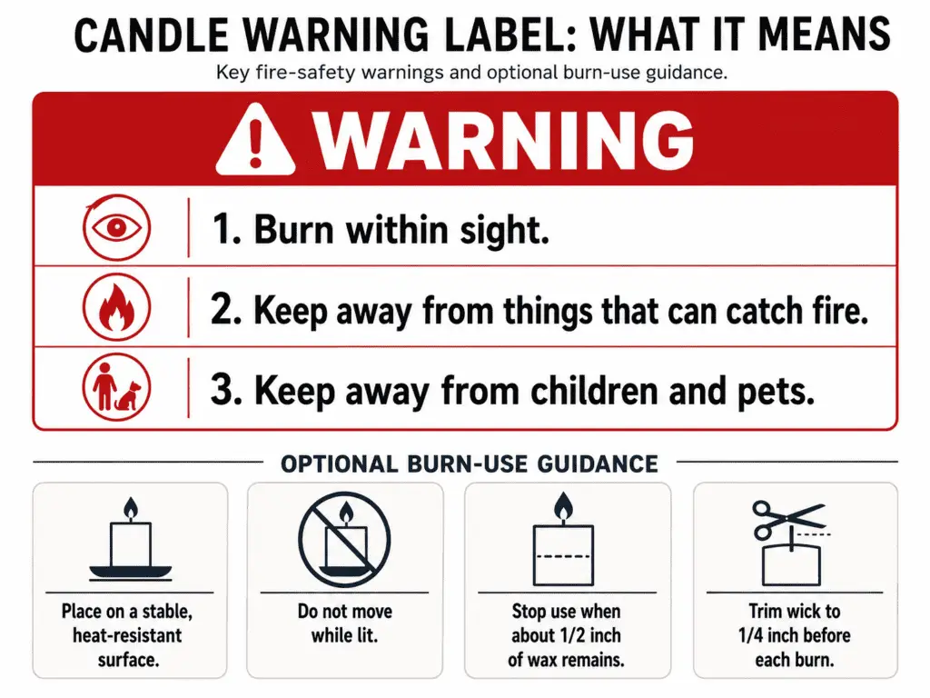
A candle warning label should include clear fire-safety warning text, supporting candle-use icons, readable formatting, and placement where the buyer can see it.
A candle warning label is the safety label or warning block that tells buyers how to burn, place, and handle a candle without preventable fire risk. Here, “must” means safety-critical baseline guidance for clear use, not a universal legal checklist for every country. The focus is warning text, fire-safety icons, readability, placement, and the final check before printing. Chemical hazard labels, fragrance disclosures, branding, materials, and printing issues belong outside this narrow safety warning topic.
What Must a Candle Warning Label Say?
A candle warning label should state the main fire-safety warnings: never leave a burning candle unattended, keep it away from flammable materials, and keep it away from children and pets.
A practical warning block should also be marked as a warning, usually with a clear warning heading and a safety-alert symbol or general warning icon. The warning cue helps the buyer recognize the block before reading the individual burn-safety statements.
Here, “must” means baseline safety wording that helps a buyer use the candle safely, not one fixed legal sentence for every country. A candle warning label gives the user a clear action, connects that action to fire-risk prevention, and keeps the warning attached to the candle or its packaging. For broader candle label requirements for selling, separate the fire-warning text from wider selling-label checks.
Use this checklist to separate main warning statements from optional burn-use guidance before printing.
| Warning statement | User action | Risk reduced | Priority | Label-space note |
|---|---|---|---|---|
| Warning cue or heading | Mark the block as a warning before the safety statements. | Missed or ignored warning information. | Main warning | Use a short “WARNING” cue or clear safety-alert mark before the warning text. |
| Never leave a burning candle unattended. | Stay in the room while the candle is lit. | Unnoticed flame, tipping, overheating, or nearby ignition. | Main warning | Keep this short and easy to find. |
| Keep away from flammable materials. | Place the candle away from curtains, paper, shelves, dried flowers, and décor. | Flame contact with nearby materials. | Main warning | Use direct wording, not decorative copy. |
| Keep away from children and pets. | Burn where children and pets cannot reach or knock the candle over. | Contact burns, spills, tipping, and accidental ignition. | Main warning | Do not replace this with a child or paw icon alone. |
| Burn on a stable, heat-resistant surface. | Place the candle on a level, heat-safe base. | Heat damage, tipping, and surface ignition. | Strong support | Use when label space allows. |
| Do not move while lit or while wax is liquid. | Wait until the flame is out and the wax has cooled. | Spills, burns, and container handling accidents. | Strong support | Works well as short supporting text. |
| Stop use near the container bottom. | Stop burning before the flame gets too close to the base. | Container overheating and surface damage. | Recommended | Keep exact wording short if space is tight. |
| Trim wick before burning. | Trim the wick before relighting. | High flame, soot, and uneven burning risk. | Optional support | Better on a care card when the warning label is crowded. |
| Follow posted burn-time limits. | Extinguish the candle after the stated safe burn period. | Overheating and container stress. | Optional support | Include only if your candle instructions state a clear limit. |
These warnings matter because each line tells the buyer what to do, not just what to avoid. Icons and decorative phrases can reinforce the message, but they cannot carry the whole warning because a buyer may not read a symbol the same way you do.
If a question moves into chemical hazards, fragrance allergens, safety data sheets, or market-specific legal wording, treat that as CLP labels vs candle warning labels, not as a fire-warning wording issue. The warning label can support safe use, but it should not be framed as proof that every selling requirement has been met.
Which Burning Instructions Belong Near the Warning?
Burn instructions belong near the warning only when they directly support safe candle use and do not crowd out the main fire warnings.
Main fire warnings come first because they address flame, heat, and access risks. Short burn-use instructions can sit nearby when they reduce misuse, while longer wick, tunneling, scent, and aftercare explanations belong in candle care card instructions.
| Burn instruction | Safety purpose | Label priority | Care-card route |
|---|---|---|---|
| Burn within sight. | Keeps the user aware of flame behavior. | Main warning | Repeat only if needed. |
| Keep away from flammable items. | Reduces ignition risk near the candle. | Main warning | Do not bury this in care text. |
| Keep away from children and pets. | Reduces tipping, contact, and spill risk. | Main warning | Do not replace with icons only. |
| Use on a stable, heat-resistant surface. | Reduces tipping and heat damage. | Strong support | Keep short on the label. |
| Do not move while lit or while wax is liquid. | Reduces burns and spills. | Strong support | Add handling detail elsewhere. |
| Trim wick before relighting. | Helps control flame height and soot. | Medium support | Put full trimming detail on a care card. |
| Limit each burn session. | Helps prevent overheating and poor burn behavior. | Medium support | Explain timing on a care card. |
| Extinguish safely. | Reduces smoke, splatter, and relight risk. | Low to medium support | Put full extinguishing steps on a care card. |
The rule is simple: if the line prevents a flame, heat, spill, or access hazard in one short instruction, it can sit near the warning block. If the line teaches long-term candle performance, it belongs outside the warning label.
Warning Labels Are Not the Same as CLP or Chemical Hazard Labels
A candle warning label is for fire-use safety, while CLP, safety data sheet, allergen, federal hazard, or chemical hazard labels address different chemical or legal risk questions.
| Label topic | Belongs here? | Route elsewhere | Reason |
|---|---|---|---|
| Fire-use warning statements | Yes | Keep in this warning label section. | They tell the buyer how to burn and handle the candle safely. |
| Candle-use icons | Yes | Keep with warning label icons. | They support burn-safety warnings. |
| Long burn-care wording | Partly | Use candle care card instructions. | It can crowd out the main warning block. |
| Broad selling-label law | No | Use broader candle label requirements for selling. | It goes beyond the warning sticker. |
| Chemical hazard pictograms | No | Use CLP labels vs candle warning labels. | They involve formula and hazard rules, not basic burn warnings. |
| Fragrance allergen disclosure | No | Use a separate allergen labeling resource. | It depends on formula, market, and disclosure rules. |
Before printing, check that the warning label says the main safety actions plainly. Treat anything beyond fire-use safety as a separate compliance or care-content task.
Which Fire Safety Icons Belong on a Candle Warning Label?
Fire safety icons on a candle warning label are visual supports for candle-use warnings, not replacements for written warning text.
In this section, fire safety icons means candle-use pictograms for burn precautions, not CLP, GHS, fragrance allergen, recycling, decorative, or brand symbols. The icon helps the buyer scan the label, while the paired text confirms the action. This reduces misreading on a small sticker or package.
Use icons only when they support the same safety actions named in the warning text.
| Icon type | Plain-language meaning | Belongs on warning label? | Needs text pairing? | Route elsewhere if chemical hazard? |
|---|---|---|---|---|
| General warning triangle | Pay attention to the safety warning. | Yes | Yes | No |
| Burning candle under watch | Never leave a burning candle unattended. | Yes | Yes | No |
| Flame near objects | Keep away from flammable materials. | Yes | Yes | No |
| Child and pet warning | Keep away from children and pets. | Yes | Yes | No |
| Heat-resistant surface or holder | Use on a stable, heat-resistant surface. | Yes | Yes | No |
| Do not move while burning | Do not handle while lit or while wax is liquid. | Yes | Yes | No |
| Trim wick symbol | Trim wick before relighting. | Sometimes | Yes | No |
| CLP hazard diamond | Chemical hazard classification. | No | No | Yes |
| Recycling symbol | Packaging disposal information. | No | No | No |
| Brand or decorative icon | Visual identity or style cue. | No | No | No |
Icon-only labels create risk because the buyer has to guess the action behind the symbol. A warning triangle, flame symbol, or child-and-pet symbol works best when it sits beside short text that says the behavior plainly.
A good warning icon set should pass three checks: the symbol matches a candle-use risk, the nearby text tells the buyer what to do, and the icon is not confused with chemical hazard labeling. If the symbol is a hazard diamond, formula-related mark, or allergen cue, route the question to CLP labels vs candle warning labels instead of treating it as a candle-use warning icon.
When label space is tight, use fewer icons with clearer text rather than many small symbols with weak wording. If the icon-text pair becomes too small, crowded, or hard to connect, the issue belongs with candle label size and placement, not with icon selection alone.
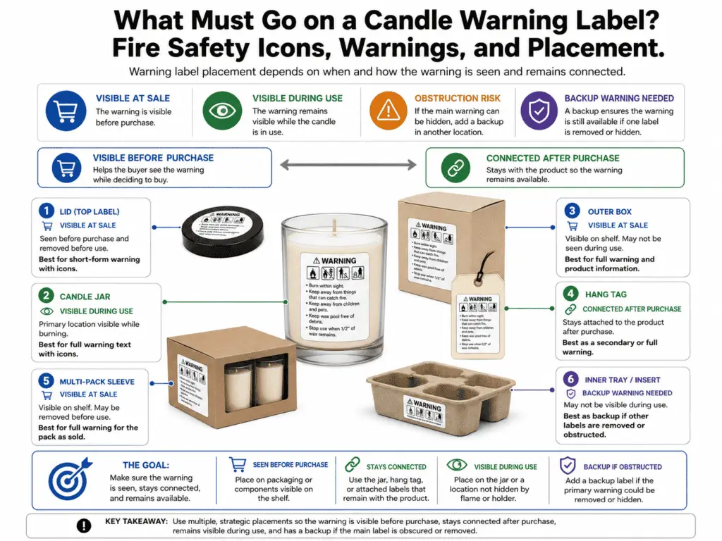
Where Should the Candle Warning Label Go?
A candle warning label should sit where the buyer can see it and where it stays connected to the candle or unit of sale.
For retail or gift-ready products, visibility before purchase matters. A warning attached only to a hidden bottom, discarded box, or removable tag may need a backup warning location so the safety information is not separated from the candle.
Placement is about warning visibility, not full brand layout, template sizing, or package design. A bottom sticker can work when the buyer can see it before purchase, but it becomes weak if a box, sleeve, stand, or display hides it. For exact dimensions, template planning, and label-space math, treat that as candle label size and placement rather than a warning-content issue.
| Placement location | Visible at sale? | Visible during use? | Obstruction risk | Backup location |
|---|---|---|---|---|
| Jar bottom | Sometimes | No | High if the candle sits on a shelf, in a box, or inside a sleeve. | Add a side label, box warning, or hang tag. |
| Jar side | Usually | Usually | Medium if branding covers the full side surface. | Keep a small warning block on the back or lower side. |
| Lid top | Often | No after opening | Medium if the lid is removed before use. | Repeat the warning on the jar or bottom. |
| Box back or bottom | Usually | No after unpacking | High if the candle is removed and the box is discarded. | Add a warning sticker to the candle itself. |
| Hang tag | Usually | No if removed | High if the buyer removes it before burning. | Add a lasting warning sticker to the candle. |
| Outer multi-pack label | Usually | No for single units | High if individual candles are separated. | Add warning text to each unit or inner tray. |
| Inner tray or insert | Sometimes | Sometimes | Medium if the buyer discards it before burning. | Pair with a unit label or package label. |
The safest placement choice is the one that answers two separate questions: can the buyer see the warning before purchase, and can the user still connect the warning to the candle later? If either answer is weak, use a backup placement.
Do not solve placement by choosing stronger adhesive, thicker stock, or a different finish inside this section. Label stock and durability questions belong with best label materials for candles, while peeling, bubbles, crooked stickers, and surface-prep issues belong with apply candle labels without bubbles.
Make the Warning Text and Icons Readable
A warning label is not complete if the text and icons are present but too crowded, faint, small, or disconnected to understand.
Readability means the safety message can be scanned, read, and matched to the right user action. The warning headline, main warning statements, icon-text pairs, and optional burn instructions should appear in a clear order. Do not use this section to set a universal font-size law; use it to check whether the safety message is usable on the actual candle or package.
| Readability check | Pass condition | Fail signal | Fix action |
|---|---|---|---|
| Warning headline | The safety block starts with a clear warning cue. | The warning blends into brand or scent copy. | Add a short warning heading above the safety text. |
| Main warning statements | The main fire warnings are easy to find first. | Wick trimming or care notes appear before fire warnings. | Move fire warnings above care instructions. |
| Icon-text pairing | Each icon sits near the warning it supports. | Icons float without nearby wording. | Place each icon beside the matching text. |
| Text contrast | The warning text stands out from the background. | Light text, busy art, or low contrast makes the wording hard to read. | Increase contrast and simplify the warning area. |
| Line spacing | Lines can be read without crowding. | Text touches icons, borders, or nearby lines. | Reduce wording or increase label space. |
| Small-format clarity | Small candles still carry the safety message clearly. | The sticker includes everything but cannot be read. | Use fewer icons, shorter text, or a package backup. |
| Optional instructions | Care notes appear after the main safety warnings. | The label reads like a care card instead of a warning block. | Move long care instructions elsewhere. |
Use the warning area for actions the buyer needs to see before burning. Leave brand typography systems, color psychology, logo order, and product photography outside the warning-label decision.
Placement by Candle Format: Jars, Tins, Pillars, Boxes, and Multi-Packs
Warning-label placement should change by candle format only when the format changes visibility, readability, or attachment to the product.
A jar, tin, pillar, boxed candle, or multi-pack can all carry the same warning purpose, but the best location may change. The question is not “Where does the label look best?” The question is “Where will the warning still be seen and connected to the candle?”
| Candle format | Common warning location | Visibility risk | Recommended backup location | Route elsewhere when needed |
|---|---|---|---|---|
| Glass jar candle | Bottom or back side | Bottom labels may be hidden at sale. | Use side, box, or lid support when the bottom is covered. | Use sizing guidance only for dimensions. |
| Tin candle | Bottom or lid | Lid warnings disappear during use. | Add bottom or side warning when space allows. | Use material guidance only if adhesion fails. |
| Pillar candle | Bottom sticker or wrap label | Bottom sticker may be missed once placed on a holder. | Use wrap label, hang tag, or package warning. | Do not turn this into a full wrap-label design task. |
| Votive candle | Bottom or package label | Small base can make warnings unreadable. | Use outer packaging or multi-pack warning plus unit marking. | Use sizing guidance for space limits. |
| Tea lights | Outer pack or tray label | Individual units may separate from the pack. | Add warning to inner tray or pack face. | Do not add a jar-size chart here. |
| Boxed candle | Box warning plus unit sticker | Box may be discarded before burning. | Add a warning sticker to the candle itself. | Keep dielines and box artwork separate. |
| Multi-pack | Outer pack and inner tray | Units may be split, gifted, or stored separately. | Add repeated warning text for individual units when possible. | Keep inventory labeling outside this topic. |
If the product is a wax melt rather than a candle with an open flame, handle the warning as a separate wax-melt or warmer-safety task instead of adapting candle flame-warning placement rules.
Format changes placement only when the candle type changes how buyers see, keep, or separate the warning. Exact label dimensions, jar-template charts, and packaging dielines should stay outside this warning-label section.
Pre-Print Candle Warning Label Checklist
Before printing, check warning text, icons, placement, readability, and whether chemical, legal, sizing, material, or care-card questions need a separate review.
This checklist reviews warning-label readiness, not legal certification. Use it after the wording, icon, placement, and readability decisions are drafted. A pass means the candle warning label is clearer for buyers; it does not prove that every selling, chemical, or country-specific rule has been met.
| Check item | Pass condition | Fail signal | Fix action | Route elsewhere if not this task |
|---|---|---|---|---|
| Main fire warnings | The label includes direct warnings about unattended burning, flammable materials, and children or pets. | One of the main warning actions is missing. | Add the missing warning in plain language. | Use broader candle label requirements for selling for wider selling-label questions. |
| Warning wording | The text tells the buyer what to do. | The wording is decorative, vague, or brand-led. | Rewrite as direct safety actions. | Keep wording fixes in this warning-label section. |
| Icon support | Icons support the written warning text. | Icons appear without nearby text. | Pair each icon with the matching warning phrase. | Keep icon-text pairing in this warning-label section. |
| Chemical hazard separation | Fire-use icons are not mixed with chemical hazard pictograms. | CLP, GHS, safety data sheet, or allergen topics are treated as simple warning-sticker design. | Separate chemical or formula-sensitive checks from burn-safety warnings. | Use CLP labels vs candle warning labels. |
| Point-of-sale visibility | The buyer can see the warning before purchase. | A bottom label is hidden by a box, sleeve, shelf, or display. | Add a visible package, side, lid, or hang-tag warning. | Use candle label size and placement for full placement systems. |
| During-use connection | The warning stays connected to the candle after purchase. | The only warning is on packaging that may be discarded. | Add a unit sticker or repeat the warning on the candle. | Keep visibility decisions in this warning-label section. |
| Readability | The warning block can be read without guessing. | Text is crowded, faint, tiny, or broken away from icons. | Shorten text, improve contrast, or move extra content elsewhere. | Use candle label size and placement for space planning. |
| Format exception | The candle format does not hide or separate the warning. | Small tins, votives, tea lights, or multi-packs make the warning hard to keep with the unit. | Add package, tray, side, or repeated unit warnings where needed. | Use placement guidance if the problem is size or format. |
| Material choice | The warning label stays attached and readable under normal handling. | The label smears, lifts, stains, or becomes unreadable. | Review stock, finish, and adhesive choice. | Use best label materials for candles. |
| Application quality | The label is flat, aligned, and readable after application. | Bubbles, peeling, wrinkles, or crooked placement block the warning. | Fix surface prep and application technique. | Use apply candle labels without bubbles. |
| Burn-care overflow | Long care instructions do not crowd the warning. | Wick trimming, burn-time advice, and care copy bury the main warnings. | Move long-form care text off the warning label. | Use candle care card instructions. |
| Final scope check | The label covers fire-use warnings without pretending to be a full legal audit. | The checklist is treated as proof of complete compliance. | Separate fire warnings from legal, chemical, formula, and market-specific checks. | Use the correct compliance resource before selling. |
The final pass is simple: the candle warning label should tell the buyer how to avoid fire-use risks, show supporting icons without ambiguity, appear where it can be seen, and remain readable after printing and application. Anything involving chemical hazard classification, full selling law, material testing, print defects, or long burn education should be routed to the right separate task instead of being forced into the warning sticker.